The Yast Revolt of 2010: Ideas to Improve Yast Software Installations
Yast has been for a very long time the front face of openSUSE and SUSE, for that matter. It has been redesigned a few times and it has matured as one, if not the only one, best control center for the Linux Desktop. In many ways, having a graphical environment that allows you to configure otherwise hard tasks, is always welcomed. Yast is one of the strongest attraction points of openSUSE and it has suffered considerable criticism over the years as well. For once, it was criticized because it was a graphical environment that "dumbed down" things. Others did not like the layout, categories, etc. You name it and I bet that Yast has received these bad mouthing.
Although I love Yast and its graphical incarnation, I am yet to see innovations in the areas of simplicity and also with being current. Here are some transformations.
I am always very happy that SUSE has tried to make Yast very simple and powerful. I got to use most of the ones that I show here. But I will focus mostly on the installation section of Yast. Why? Because, I believe that new users coming to SUSE have to learn how to install software on SUSE. We know that Linux has a few package installation methods that can be hard to describe or make available to novice users using SUSE for the first time and wanting to get programs installed.
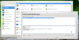
The current method seems to be a little too long and rather complicated. Starting with finding the Yast Install and Remove icon. These are the steps.
You see here that the longest way to find the application installer from Yast is about 5 clicks away from you. Some may say, "well, you can find it if you search for it on Kickoff." Others say "You can go to Computer and you will find it." While these two assertions are correct. I think that novice users do not even know how kickoff works, neither can they guess that the icon they are looking for is in the "Computer" tab. I believe, most users will first go to the Internet to find their applications. They'll discover that they do not work on Linux if they come from Windows or Mac. It would be hard for them to realize that their installations are done through a special Yast module.
For this reason SUSE created 1-click installs. Users go online to the openSUSE website, search for a package and then install it with 1-click install. I love this feature, it is much simpler than Ubuntu's Internet based installations. Following some tutorials, I generally end up adding repositories to the deb package system, then installing the program. SUSE solves those extra steps with 1-click install.
Once users reach the desired installation module within Yast, another interesting thing happens. It is an avalanche of information.
First of all, Yast opens two more windows to do the installation. The Yast module which contains all the categories is one, then the installation window, and finally the installation feedback window. 3 Windows until you see what is going on. It doesn't stop there. If you notice at the last window on the screenshot, you will see a few things going on. First (I was installing Dropbox, by the way, and ended up installing 400 MB of information, crazy) you see a window divided in 4 parts. The first two give you a number of packages to be installed and where they are coming from, the second one gives you feedback on the particular package that is being installed at the moment, third comes the progress bar for the individual package installed at the moment and finally there is a progress bar that shows the overall installation progress. That was a lot to type for something that can be done simpler. Do you think that novice users will want to see this? I think, pragmatism is a quality that characterizes novice users. They want the job done, simply and fast, and honestly, I do too. I hardly ever pay attention to all this feedback on this window.
Another idea that has flooded the market recently is related to cell phones. Once Apple created the iPhone and the iPod, they created an online store that would give you applications for these devices. iTunes for example, opens and connects to the online store on the spot, to make you see some apps that you might want. After they did this, many other companies have dome similar things. Websites featuring small and practical applications for a variety of devices, music players, tv, phones, etc. The online interface provides a very stylish ad customized way to present users with options that they might want.
Thinking about this and also the 1-Click installation system done by openSUSE. I believe that SUSE created an online app store without realizing it. SUSE Has the technology already, they just need to tweak Yast, the installation module, to be like this. In my spare time I thought of something extremely simple to use that, I think, can be done without much pain.
Here are the mockups. These are not perfect, but they can get to be with your suggestions.
Tell me what you think.


4 comments:
It will at least look neater. The current YaST is actually quite depressingly "anti-noob" especially the Package Manager. I find Synaptic to be quite noob friendly and is one of the things I miss the most from my Ubuntu days.
Nice. I agree with you and msian_tux_lover. The YaST package manager I had to get used to in 11.0 to 11.2. I actually enjoyed it once I got the hang of it. It made logical sense.
The current layout had me completely baffled. 'anti-noob' is very subtle, actually. It made things very convoluted and difficult to understand. It took me an hour to figure out how to upgrade a package (yes, maybe I am noob for it). The point ultimately is that it should be made to be much leaner. I mean, hell, this would certainly be a hump for someone should they switch over from Windoze. Adding on the complexity of 11.3's Package manager just put another layer of fear for the user.
That is very true. What do you guys think of the mockup I made and the idea of an internet-based native installation program, using the 1 click features.
Hi,
Did you heard about the Lancelot menu for KDE? http://lancelot.fomentgroup.org/main
Regards,
Luuiz
Post a Comment