Chameleon Brand Image
All of you who read my blog and communicates with me through the openSUSE channels knows that I am passionate about the chameleon image that comes along with openSUSE. It is one of its distinctive images and it is also part of its logo.


Although openSUSE is not Apple and our design team is not quite as sizable, it is important to remember that we too have an image based on a very striking reptile. The chameleon has many variants in its family and it's natural image "rawness" has always made an impact on me. My suggestion is no that we name our releases after different chameleon species, that would make our names run out in just a couple of years given the many releases that we produce. However, if something is to be learned from Apple's and other companies' logo examples such as CORNING's Gorilla Glass
 is that natural-based images make a strong impression and makes people endear themselves with a very positive and intuitive way of recognizing a brand. openSUSE has this potential right at home through its chameleon logo. Although for general purposes the chameleon is a vector-based graphic embedded into the official project's logo, there are many other creative ways that you can use this and make an impression.
A couple of weeks ago I noticed a request in the mailing list asking to prepare a graphic that would be included in a magazine showcasing the openSUSE conference. I decided to take on the challenge and produce something striking, eye-drawing and relevant. With much thought I decided to find a simple, yet beautiful graphic to promote openSUSE as a brand. This is what came out.


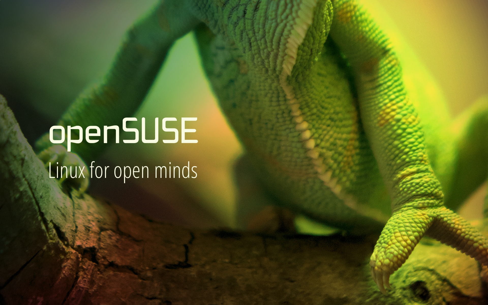
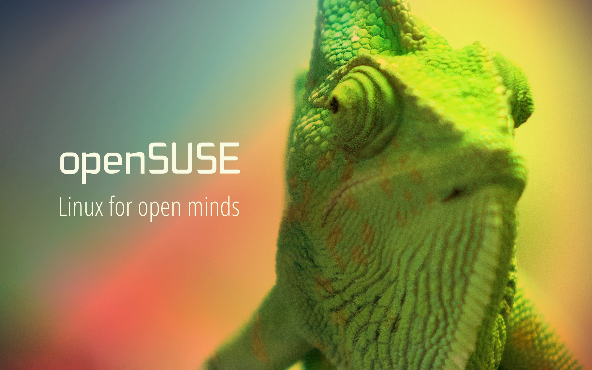
In former releases and under former design teams the image of this chameleon was also present. Graphically, this set the striking difference, in my mind, between openSUSE and other distributions. Most distributions rely on simply made logos from SVG. While these other logos and brands are generally well-designed and get across with their point, they tend to lack a reality. By that I mean a real, natural counterpart that can also be included in their marketing image.
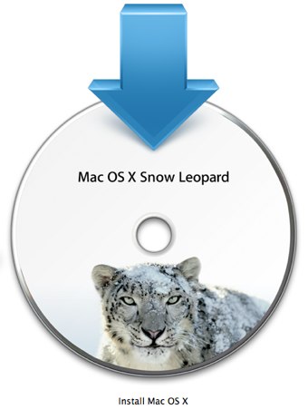
Take for example Apple design. When they decided to brand their OS releases, they chose the names of wild felines such as cheetah, puma, jaguar, panther, tiger, lion, and so on. If you take their marketing strategy over the course of these releases, I believe, they realized that there was much more visual power in using real life images rather than keeping computer generated graphics as their face.
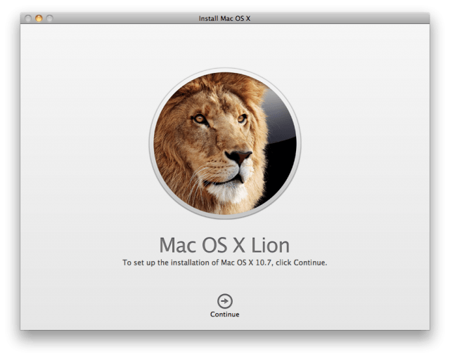
That was up to the release of Leopard. Then there came a change.
A couple of weeks ago I noticed a request in the mailing list asking to prepare a graphic that would be included in a magazine showcasing the openSUSE conference. I decided to take on the challenge and produce something striking, eye-drawing and relevant. With much thought I decided to find a simple, yet beautiful graphic to promote openSUSE as a brand. This is what came out.
I really enjoyed that design. It brings back that natural beauty of our logo, it promotes our brand, it shows versatility, and it draws attention. I created a few other iterations in case there are more opportunities to bring and integrate our chameleon into the rest of our brand design.


0 comments:
Post a Comment