User Riots: What Does Not Work with Launcher Menus (Part 2)
Before I enter this subject, I would like to recognize the effort and great genius that the people who have worked with GUI design have done with Launcher Menus. I am pleased to say that I have been an avid user of these small applications for all the years that I have worked with computers.
The subject matter of this article is a very unpleasant one for me. I am to critique the shortcomings of these menus and I feel that it would be necessary to clear a couple of things before I get started. First, the analysis being done right now focuses on the negative aspects of the launcher menus the way "I" see it. The article does not represent the work of a group of people, just me. Second, while the subject of this discussion is negative in nature, these are not to be taken as personal attacks against the people who so passionately worked on them. They are respected and thanked for their efforts. Third, I believe it is necessary to look at what "is not so effective" with these menus, in order to come up with a solution that can encompass all the negative aspects that these menus currently have. To be self-critical is a relevant element of design. The failures presented by these menu examples are to be thought of collectively and not individually. These are lacking elements that appear across many menus and different platforms.
Without further due, here are the areas that Launcher Menus deal with ineffectively.
Hand Position: Ergonomics
Various stats suggest that 85% of people are right handed. These could also be interpreted as the majority of people using computers are right handed as well. The majority of Launcher menus sit on the bottom left of the screen. It has been so for Windows since they created the Start Menu and for others after them, such as Gnome and KDE. I see a problem with this. First, although it is a simple pixel to find, it restrains the right hand. 85% of people have become used to an unnatural location for the Start Menu. Although some may argue that there are trackpads and all that, but truth of the matter is that most of the times, the screen cursors sits in areas that belong to the half where the hand is. In this case, the pointer will mostly sit on the right half of the screen because it is the right hand that is being used to control it. Then the right hand has to do an unnatural movement across to the left, and not only to the left, but down as well. It is trying to reach the Start Menu.
 Probably then, the bottom left position for the Launcher menu is not the best. We might not feel it is a problem since we have become used to it, but I do not think it is well designed. It might work for left handed people but not for me.
Eye Position: Ergonomics
Another problem that I find (this is just personal experience) comes from the position that my eyes have to take in order to locate elements on the screen. A lot of times, the eyes have a natural tendency to place items from a screen higher so that the head and the eyes do not have to look down in order to see something. Every time, I have to look down to the bottom of the screen I squint a little and it seems more unnatural than having my eyes set close to the top edge of the screen. I actually feel very happy every time I use Macs, because they have the window menus at the top, although it is annoying to travel all the way down with the pointer to the dock to launch programs. In fact, a lot of action happens near the top edge of the screen. Applications have all of their editing elements atop which draws the eye to the top, and suddenly you have to launch a program. Then you look down and leave the position you were in.
Look at these ladies:


Now, one that really takes my time is Kickoff. I believe Kickoff is the biggest magneto inside openSUSE. They simply put everything in there. But all I do with it is to launch applications. Everything else, I can access through the file manager and other simple solutions.
The subject matter of this article is a very unpleasant one for me. I am to critique the shortcomings of these menus and I feel that it would be necessary to clear a couple of things before I get started. First, the analysis being done right now focuses on the negative aspects of the launcher menus the way "I" see it. The article does not represent the work of a group of people, just me. Second, while the subject of this discussion is negative in nature, these are not to be taken as personal attacks against the people who so passionately worked on them. They are respected and thanked for their efforts. Third, I believe it is necessary to look at what "is not so effective" with these menus, in order to come up with a solution that can encompass all the negative aspects that these menus currently have. To be self-critical is a relevant element of design. The failures presented by these menu examples are to be thought of collectively and not individually. These are lacking elements that appear across many menus and different platforms.
Without further due, here are the areas that Launcher Menus deal with ineffectively.
Hand Position: Ergonomics
Various stats suggest that 85% of people are right handed. These could also be interpreted as the majority of people using computers are right handed as well. The majority of Launcher menus sit on the bottom left of the screen. It has been so for Windows since they created the Start Menu and for others after them, such as Gnome and KDE. I see a problem with this. First, although it is a simple pixel to find, it restrains the right hand. 85% of people have become used to an unnatural location for the Start Menu. Although some may argue that there are trackpads and all that, but truth of the matter is that most of the times, the screen cursors sits in areas that belong to the half where the hand is. In this case, the pointer will mostly sit on the right half of the screen because it is the right hand that is being used to control it. Then the right hand has to do an unnatural movement across to the left, and not only to the left, but down as well. It is trying to reach the Start Menu.

Eye Position: Ergonomics
Another problem that I find (this is just personal experience) comes from the position that my eyes have to take in order to locate elements on the screen. A lot of times, the eyes have a natural tendency to place items from a screen higher so that the head and the eyes do not have to look down in order to see something. Every time, I have to look down to the bottom of the screen I squint a little and it seems more unnatural than having my eyes set close to the top edge of the screen. I actually feel very happy every time I use Macs, because they have the window menus at the top, although it is annoying to travel all the way down with the pointer to the dock to launch programs. In fact, a lot of action happens near the top edge of the screen. Applications have all of their editing elements atop which draws the eye to the top, and suddenly you have to launch a program. Then you look down and leave the position you were in.
Look at these ladies:

Well, these ladies show what I am talking about. Although these are pictures taken from stock images, they show something that happens all the time. Your eyes are generally wandering on the higher plane of the screen.
Crowdedness: Just TOO MANY!
One big problem that all these launcher menus have, and menus in general, is the one about sorting the elements withing the menu. How do you do it? what's the best method available? How does one manage the ever growing population of the launcher menus?
One thing that happens overtime, is that no matter how cool you are with your information, you will accumulate tons of it. It is no different with launcher menus. They get crowded fairly fast. Think of Windows, they have invented a couple of ideas so that they can manage your applications. From Windows 95 and on, they did not do much about it, the menus just got very big and covered the whole screen. The same happened with XP. But once Vista and then Windows 7 came on board, this changed. They decided to work more with favorites and seclude the rest of the applications inside the limited area of the start menu.
Although it looks better, it does not solve the problem. I actually think that it makes it worse. Because, now the menus cannot go all along the screen, rather they stay packed in, and hidden inside the launcher menu. As a help, Windows offers a search field at the bottom. But what if you do not remember how to spell your programs' names? or file names?
Spacing: Ergonomics?
I don't really know where this one goes, but it is a very hard one to explain. I just want to add this because I have always had issues with this one. I do not really know what is the right spacing between items on the list of programs and favorite applications, but I sure know what I don't like. So here it goes.
In the current windows 7 menu there are different kinds of spacing between the items list. The favorites and folder sections of the menu have more spacing than the menu with the programs. The programs are actually a little harder to pin down with the mouse pointer. Probably something should be done about that. But they are so many items (Don't get me started on how much trial software you get when you buy computers from the stores) that they need to pack them closer together to be seen.
On a Mac, the story is a little different but unsolved as well. They do not have a problem with spacing, necessarily, since the dock takes care of that fairly well. It is a more visual recognition approach and it works well. But just imagine what the dock will look like when you try to put the amount of items you have on a Windows start menu onto the dock. Then it becomes a problem.
And this is what I am talking about. As the dock fills with more icons, they need to gather the horizontal space needed to accommodate all of them. The dock shrinks the icons and the user has to go through this long line of icons until you visually identify the one you need.
On Gnome, for exaple, the story is not about small spacing and hard to pin, but rather the spacing is sometimes too big.
This image explains what I am talking about. Look at the size of each item and each description. It gets to the bottom of the screen so fast that in many cases you have to scroll up and down to sift through this long spaced menu. I run Ubuntu some times and I really get annoyed by this, especially because Gnome has the "simplicity" idea with them making 1 application per task. It is very useful, I appreciate it very much, but they become crowded too fast on the launcher menus.
Lack of Simplicity
This idea is also hard to work out. It depends heavily on the user and his/her idea of simple. But here is mine. I do not think menus should have long labels. Some have opted for shortening the labels and only leaving the application name and the icon. Such as the OSX Dock. Others such as Windows prefer full names and Gnome and KDE prefer them all. The icon, the application name, and a descriptive label. That to me seems a little too much in view of the idea that people become used to an application's use and identifiers over time. I do not ever read a label description. I generally recognize the application because I know the name and recognize the icon. The problem on OSX though is that they hide it. You never the the application label until you hover the icons containing it, and on Windows I just have to squint very frecuently because the items defer in labeling so much that you find yourself with a few entries for "Firefox." Such as, "Firefox (priavate mode)," Firefox, uninstall," "Firefox, folder." And the list goes on and on.
On examples like these, you don't even see the name of the application. Ubuntu thinks that people recognize items mostly by what they do, and although it is a good strategy, I always think of people saying "hey, if you want to transfer music to your iPod, you just gotta pop iTunes open and plug it" as opposed to "hey, if you want to transfer music to your iPod, you just gotta pop the music player open and plug it." Odd, right?
Too much going on
One last thing I want to mention, and I am not sure how this could be achieved, but there seems to be a great deal of things going on with the launcher menus. On Windows, for example, the menu is comprised by Favorite Applications, Computer Settings, Shutdown Menus (I don't like this one really), Program List, Search Bar, User Name Identification and Picture, Networking, Printers, etc. On OSX, for example, the approach is the opposite. On the dock there is nothing more than icons, although these icons can be anything. In a sense, you could say that the OSX dock gets a lot of things going on but depending on th user's inclinations. On KDE and Gnome the thing does not get better, although there have been some good ideas out there trying to simplify categories and other things.
But there is a prevalent idea among designers that launcher menus "need" to be "access-packed." You can go anywhere with your launcher menu. But Why? why can't I choose where to place my own things? or at leas, why can't I have more separated items. I believe, it is good to have many ways to access important elements in your operating system, but how many is enough? I get confused, maybe 'cuz I am pretty stupid, when there are so many ways to get somewhere. I find it interesting when I help friends for example to access, let's say, Windows File Manager with the key combination Win Key + E. They always did it with: start menu> Computer. It seems to me that users are willing to use one way of doing things even though there are more methods. They become used to one idea per action.
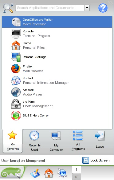
Just check this out. Kickoff has: Favorite Applications, Recently Used (everything), My Computer, with all the folders you are looking for, All programs, Shutdown Menu. Additionally, it packs icons, application names, and descriptions. When you see folders, it gives you a sub label with the address location (which sometimes is too long to display completely). They also include the user name and machine name, a help button, a search bar, a search bar icon, and above all, they do tons of navigation trough menus. you go back and forth through them, especially through the programs section. If you have a ton of items, then you scroll a lot.
There are lots of areas that can be improved for launcher menus. I hope that by taking a look at the annoyances I have found in them, we can come up with positive solutions for users. I believe that openSUSE can regain control of the desktop.
Next episode is about the GOOD ideas that have come out of the launcher menus and in the last article, a solution for these research. The creation of concept launcher menus. Stay tuned and thank you all for your great support.
Andy


16 comments:
Post a Comment